When building a website, the design process should prioritize clear visuals, user experience, and efficient collaboration. One powerful approach to achieve these goals is by starting with a website mockup. Mockups bring several advantages, from aligning client and designer visions to saving time and resources. Here’s a closer look at why we recommend using a mockup and the various tools available to create one.

1. Visualize the Final Design Early On
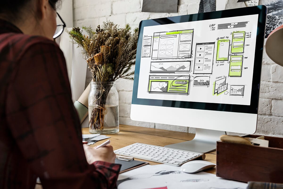
A website mockup provides a visual preview of the design, showcasing layout, colors, typography, and other elements. This gives both designers and clients a clear, realistic picture of how the website will look once it’s complete. It helps bridge the gap between abstract ideas and tangible designs, making it easier to assess if the design aligns with branding and business goals.

2. Collect Feedback with Ease
Mockups simplify the feedback process. Clients can visualize the layout and suggest changes before any coding begins, which is crucial for staying within budget and avoiding costly alterations. By collecting feedback at the design stage, the development phase can proceed smoothly, with fewer interruptions.

3. Facilitate Communication Across Teams
With a mockup, project stakeholders—clients, managers, developers—have a common reference. This promotes clearer communication and ensures that everyone is on the same page regarding the website’s look and feel. Mockups are especially helpful for clients or team members who may not be tech-savvy, allowing them to understand the design in a more concrete way.

4. Enhance User Experience (UX) Planning
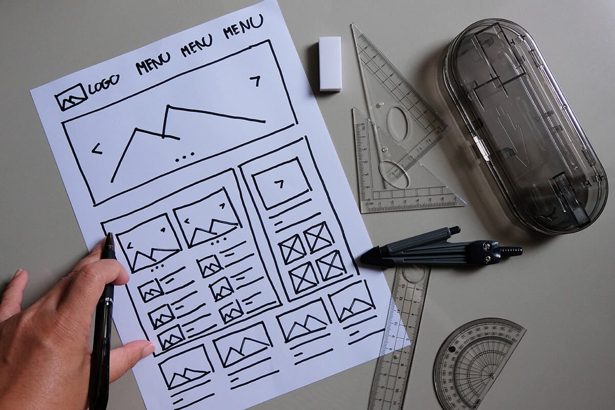
Mockups allow designers to consider the user journey early in the process. They can plan for elements like navigation, call-to-action placement, and content flow. This early UX focus ensures the website will be user-friendly and visually appealing, ultimately helping increase user engagement and satisfaction.

5. Ensure Consistency Across Devices
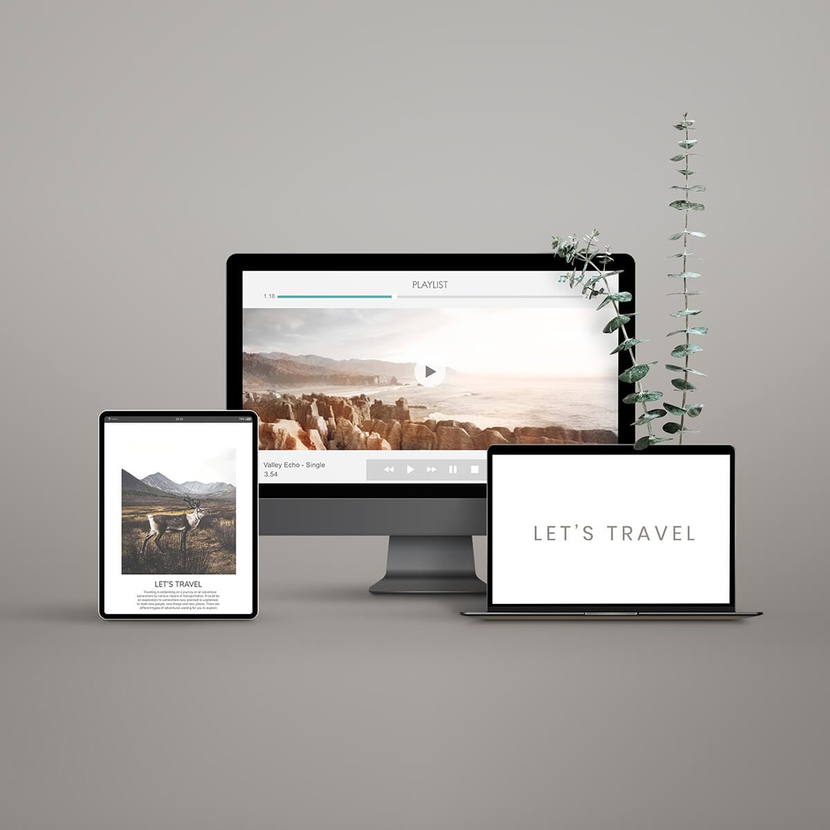
With mockups, designers can address how the website will look on different devices, ensuring consistency in layout, colors, and fonts. Mockups allow adjustments for mobile and tablet views before development begins, creating a cohesive experience across all platforms.
Tools for Creating Website Mockups
To create effective mockups, several tools offer valuable features:
- Adobe XD: Known for its collaborative capabilities and responsive design features, Adobe XD is a go-to for designing realistic mockups.
- Figma: Figma enables real-time collaboration, making it ideal for teams. It’s web-based, so no installation is needed, and it supports mobile and desktop previews.
- Sketch: Popular among Mac users, Sketch offers a robust plugin system, which can enhance the design process and integrate with other tools.
- InVision: InVision focuses on prototyping and feedback collection, making it perfect for presenting mockups and gathering input from stakeholders.
- Moqups: This tool is lightweight and simple, excellent for creating initial layouts and experimenting with design ideas.
Each of these tools offers unique strengths, so selecting the best one will depend on the project’s needs, team preferences, and budget.
Conclusion
Starting a website design with a mockup is a strategic approach that saves time, reduces misunderstandings, and ultimately results in a website that meets both client expectations and user needs. Mockups are an investment in quality, and with the right tool, the process can be efficient, collaborative, and enjoyable. So, before diving into development, consider creating a mockup—it’s a choice that will pay off in the long run.
